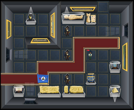
Back from GDC! However, as is typical when you get back from a trip, work didn’t really start happening until Thursday, when we had a meeting about art style, or more specifically, animation, tilesets, and our plans for cutscenes. Seeing as the most detailed work has been done on tilesets, I’ll talk about those.
As we’re making a top-down game, one of the tricky things to get right is perspective. If you go back and look at a top-down Zelda game (or any top-down game, really), you’ll notice that the perspectives are all over the place. In a single room of a dungeon, you’ll see that the walls are leaning inward, characters have kind of got a 45 degree view when looked from front or back, but walk absolute left or right, some objects are birds-eye view, while others are completely out of proportion to anything else. The closer you look at it, the more “wrong” it all seems. But! When you play it as a game, it all comes together.
So you have to get that balance between getting perspective correct, but not at the expense of the player not understanding what they’re supposed to be doing, or whether they can interact with an object. This image is early and does not represent the final game! Now, let’s have a look at it:
Here, there are some important things to take into account:
There’s more stuff that we’re aware of too, but these are just a few points. The tough thing is making sure the art looks nice, but not at the expense of confusing the player.


